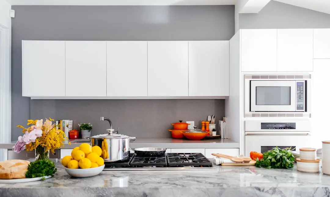
Choosing the right colors for our living spaces can have a significant impact on our mood and overall experience. While we may not always consider the colors of our rooms, furniture, or walls, they play a crucial role in influencing our emotions and thoughts on a daily basis. These home color palettes that can influence mood and atmosphere
From the simple act of reaching for a tub of ice cream to binge-watching our favorite drama series, colors have the power to completely transform our mood. Therefore, when it comes to creating a personal sanctuary at home, it is essential to carefully select the appropriate colors.

Color goes beyond being just a universal visual language. It holds the power to completely transform your experience and greatly impact your mood. Even though we may not consciously think about the colors in our homes, furniture, or walls, they have a daily influence on our emotions and thoughts. Therefore, it is crucial to carefully choose colors and create well-thought-out color schemes for your personal sanctuary, also known as your home.
Having a well-chosen color palette is crucial for seamlessly transitioning between different spaces. The right colors can instantly elevate a dull area and make it visually captivating. Selecting the perfect hue is a significant and individual task. Colors have the power to conceal any imperfections in your home and completely change the overall atmosphere.
Having the right color palette can make the process of painting your room much easier. A color palette consists of specific color schemes used in different areas of your home’s interior design. By creating a color scheme for your home, you can decorate it more efficiently as it helps to narrow down the numerous options available.
In this informative article, we aim to provide you with these diverse color palettes to aid you in determining the overall colors and ambiance of your sanctuary and in crafting your dream home. However, before delving into these palettes, let us first explore some fundamental color principles that will guide you in selecting or creating your own palette. Unlock the Power of Colors, check this Home Color Palettes that can Influence Mood and Atmosphere
The Fundamentals of Home Color Palettes
Color is often categorized into two main groups based on their tones: warm and cool.
What are the differences between warm and cold colors?
Cool hues such as blue, purple, and green can create a comfortable and tranquil environment. On the other hand, warm colors like yellow, red, and orange can evoke warm feelings and provide an immediate energy boost. It is important to choose the precise shade that represents your desired atmosphere, rather than simply selecting a color. Light colors are visually appealing and can make rooms appear brighter and more spacious. Conversely, darker hues can create a sophisticated feeling and make a space feel more private. Instead of following trends, use paint color to your advantage by selecting a shade that reflects your preferences and personality. Lastly, opt for hues that complement each other to create the perfect combination.
When choosing colors for your home, it is important to consider the impact they can have on the overall atmosphere. Light hues are known to be visually appealing as they create a brighter and more spacious feel in the rooms. On the other hand, darker colors can add a touch of sophistication and create a more intimate ambiance in the space.
We have compiled a collection of 8 color palettes featuring a range of tones. These palettes can help you in selecting the perfect colors and setting the desired mood for your sanctuary.
Color Palette for Your Home
1. Midnight Blue
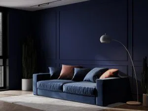
This home palette features a stunning combination of blue and gray colors, creating a beautiful and powerful aesthetic. The use of different tones of blue throughout the various elements adds depth to the overall design. It is recommended to try this palette in a space with ample natural light to enhance its visual impact. From the walls to the sofa, blue is prominently utilized, accompanied by subtle complementary hues to introduce a touch of light. If you are seeking a classy look, this modern blue color palette could be the perfect choice for you. Moreover, this versatile color scheme can be applied to any room in the house, whether it is the kitchen or the living room. The flexibility of this palette allows for slight adjustments based on your personal style, resulting in a harmonious blend of comfort and sophistication.
2. Scarlet Room
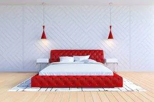
This appealing blend of red, white, and grey presents a sleek and trendy aesthetic. The incorporation of the red color scheme establishes a lively ambiance that is well-suited for a range of settings, such as bedrooms and bathrooms. The white ceiling, walls, and linens harmoniously enhance the striking red throw cushions and lamp top, as well as the exquisite wall art.
The combination of red and grey complements the grey hardwood floor nicely. Adding a bold red color to color palettes that include white creates a more impactful and less dull look. In this case, the main color is red, can be utilized to design a complete color scheme for a home. This can serve as inspiration for designing the master bedroom, as it incorporates all the appropriate hues, allowing us to create our own beautiful version.
3. Lilac Dreams

Did you ever imagine that a monochromatic purple color scheme could be so successful? The various shades of lilac and lavender can create a truly calming atmosphere. These color palettes are particularly effective because lilac pairs beautifully with minimalist furniture and clean lines. The gentle violet tones complement each other and bring a sense of aesthetic balance. This color scheme can be implemented in various spaces such as your living room, children’s room, or nursery.
In this particular home color palette, the combination of white on the table exudes elegance. The rug is skillfully coordinated with the rest of the area, resulting in an unexpected yet fitting color scheme.
4. Christian Grey

The design elements and color palette employed in this area play a significant role in creating an attractive interior color scheme. The use of charcoal and slate grey in the living room adds a cozy and inviting ambiance, while the unexpected brass accents in the lamp shade introduce a distinctive touch of color. The warm brass accents on the yellow lights complement and elevate the other elements present in the room. Additionally, the modern aesthetic of the grey wall further enhances the overall feel of the space.
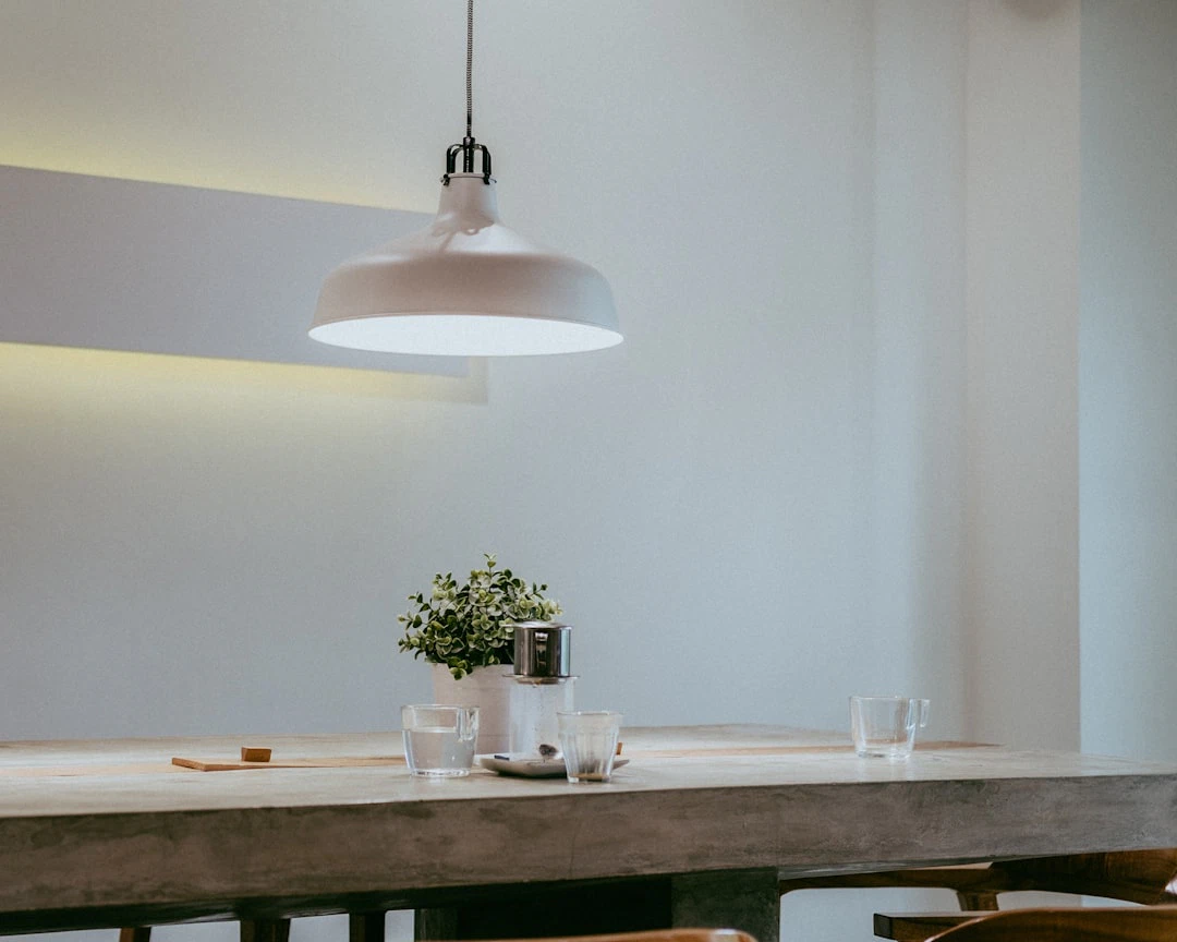
5. Nordic Hour
This living room combines modernity with an artistic touch. The inclusion of a geometric rug adds a softness to the overall look of the space. The unique table and pendant light fixture complement each other well, contributing to the tranquil atmosphere. The wall hangings, featuring the same color palette, enhance the aesthetic appeal of the area. The black background of these wall hangings, along with contrasting khaki hues, adds a pop of color. Even the cushions on the bed create a cozy ambiance. While white dominates the color palette of this room, the addition of black, grey, and khaki colors makes the area truly eye-catching. You can take inspiration from this room to create a delicate and elegant color palette of your own.
6. Aquamarine by the bay

The beachfront room in this space incorporates a blue and gray color scheme, which is highly suitable. Instead of completely eliminating the white, the room selectively replaces certain areas with shades of gray. By combining these colors with blue, the room offers a wider range of decorative possibilities. This color palette features a gentle paint hue along with contrasting colors that are not overly vibrant. The serene blue shade complements the aquamarine sofa, as well as the white ceiling and pillar. While a white dove tint can serve as the dominant color, a couple of shades of blue can be added to break up the predominantly white palette. To enhance the brightness in this charming coastal home, the floor and throw pillows are kept light in color. Keep these ideas in mind when creating your own coastal-inspired home.
7. Tealquoise Walls

The chosen color palette for this house, as well as the interior design, takes inspiration from current color trends. Turquoise is a highly favored shade among designers due to its versatility, as it can be easily paired with any paint color on the color wheel. It offers a fun and playful option that can be used subtly, luxuriously, or boldly. The combination of white and dark khaki brings a cohesive and seamless look throughout the area, creating a coastal vibe reminiscent of the sea. The accent wall incorporates warm colors with a touch of white, contributing to a brighter and more open space. The inclusion of white furniture adds a geometric pattern that enhances the overall aesthetic and serves as a stunning home decor element.
8. Peruvian Brown

When it comes to interior design, Peru is a popular source of inspiration for homeowners. The design style in Peru incorporates natural materials, vibrant colors, and intricate patterns. Many Peruvian homes showcase a combination of whites and earthy tones, creating a luxurious atmosphere. This modern interior design utilizes a mix of glass, wood, textiles, and metals to create a dynamic and inviting space. The wooden ceiling and floor feature authentic designs, while the light-colored walls are adorned with large glass windows that allow ample natural light to enter. To balance the space, a light-colored rug is placed on the floor. Despite having many features, the area is thoughtfully arranged and harmonious, creating an elegant look. The color palette predominantly consists of brown and white, with pops of orange for a trendy touch. The main source of lighting is natural light, but the addition of circular hanging lights adds a contemporary flair. The couch is a lighter shade of brown, complemented by throw cushions in the same color family. On the other hand, a geometric print sofa adds a playful element, accompanied by earth-tone pillows.